


Logo Design for the Countering Hate Committee
During my internship at Peel Regional Police, I designed branding concepts for the Countering Hate Committee. The goal was to create a logo that reflected inclusion, protection, unity, and community support.
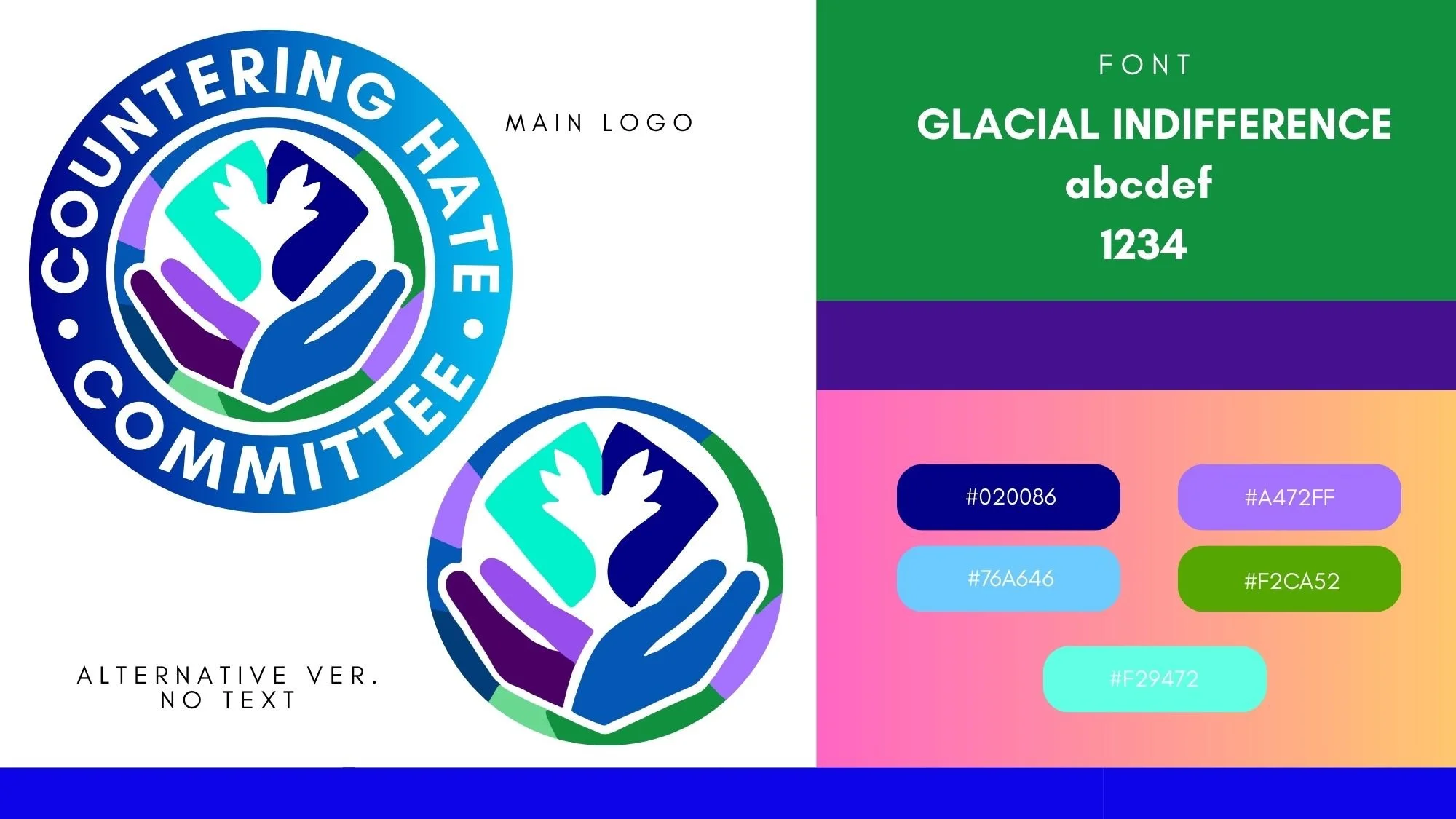
Early Concept Design
These first-round logo concepts explored different visual directions for the Countering Hate Committee, including themes of unity, protection, compassion, and community support. Each concept helped shape the final identity by testing how symbolism and color could communicate the committee’s mission.
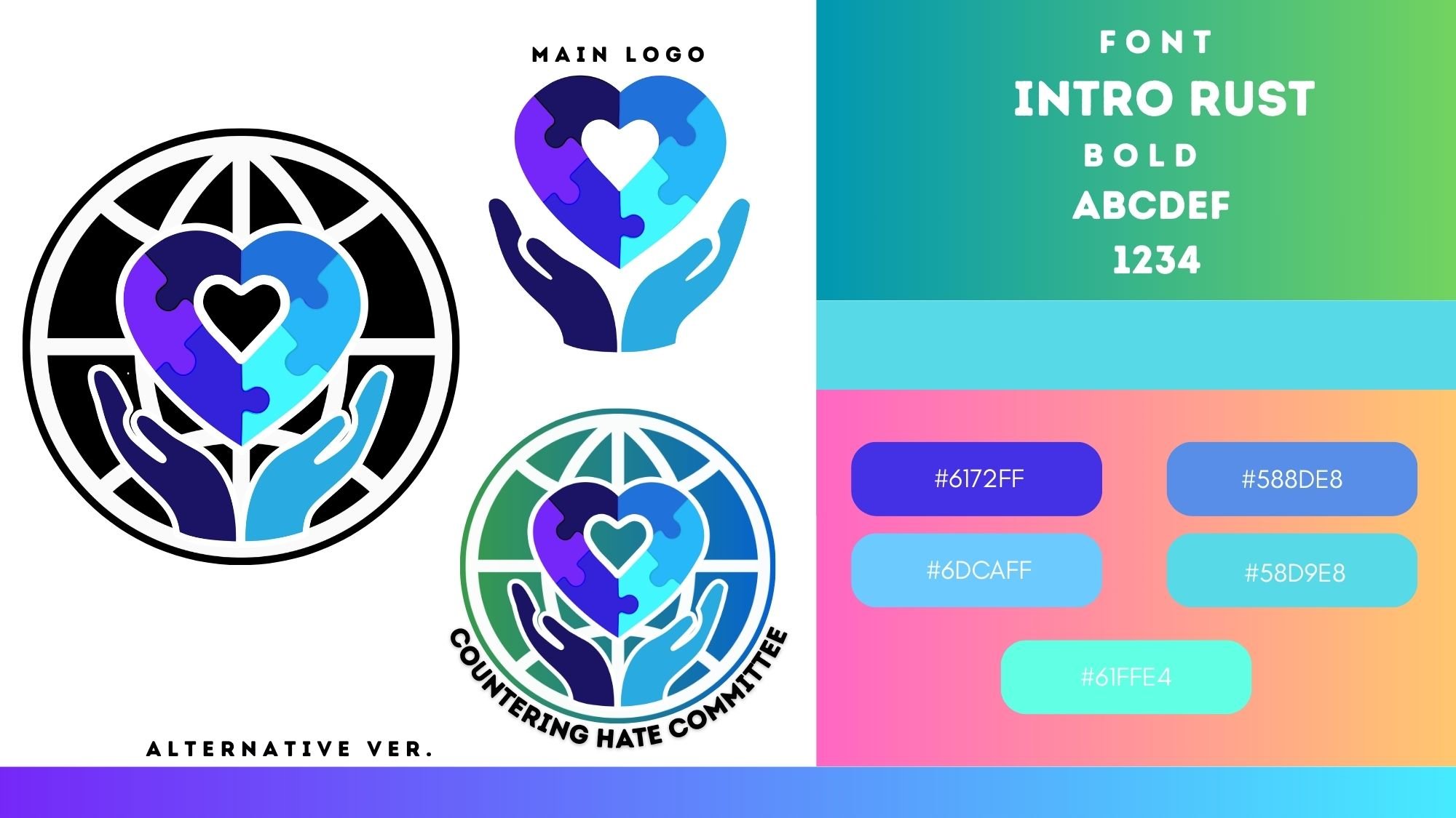
More Designs… and More Designs
It was a long process of creating logo ideas, bringing them to committee meetings, taking in the feedback, and then going right back to the drawing board more than once. :)
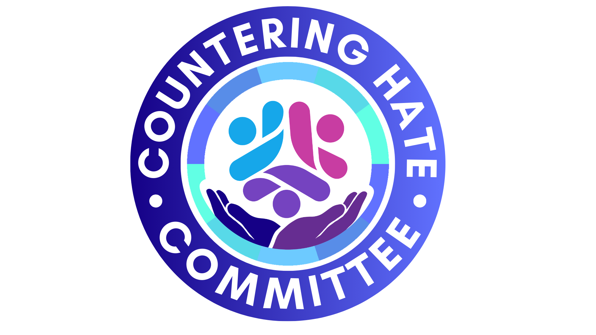


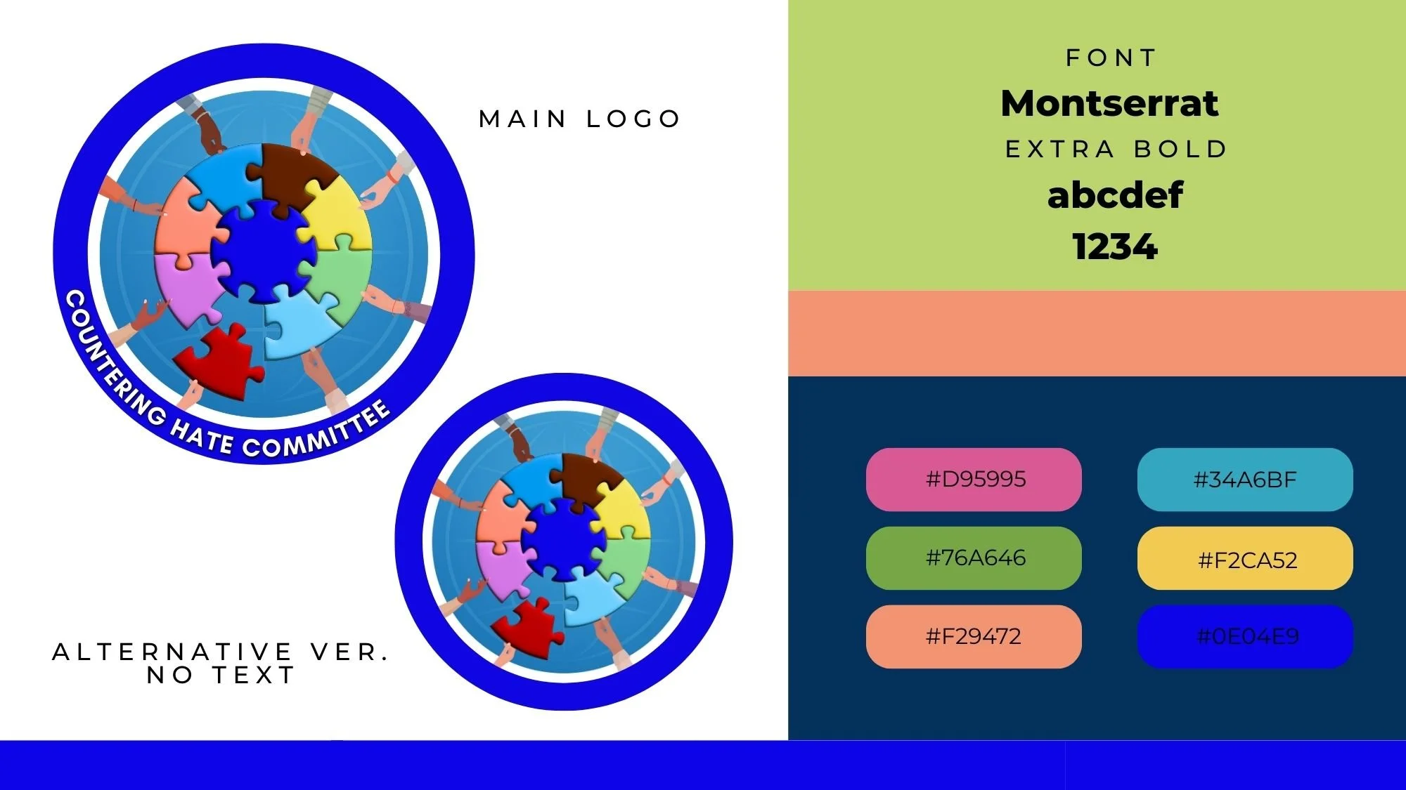
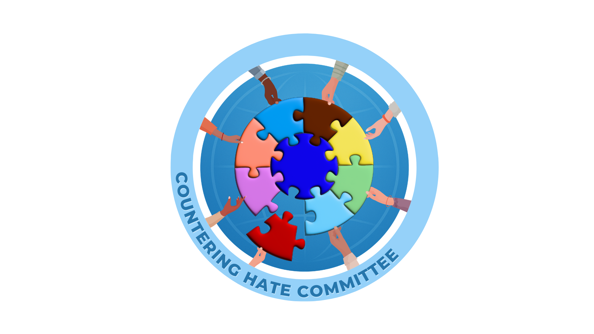
The Final Logo
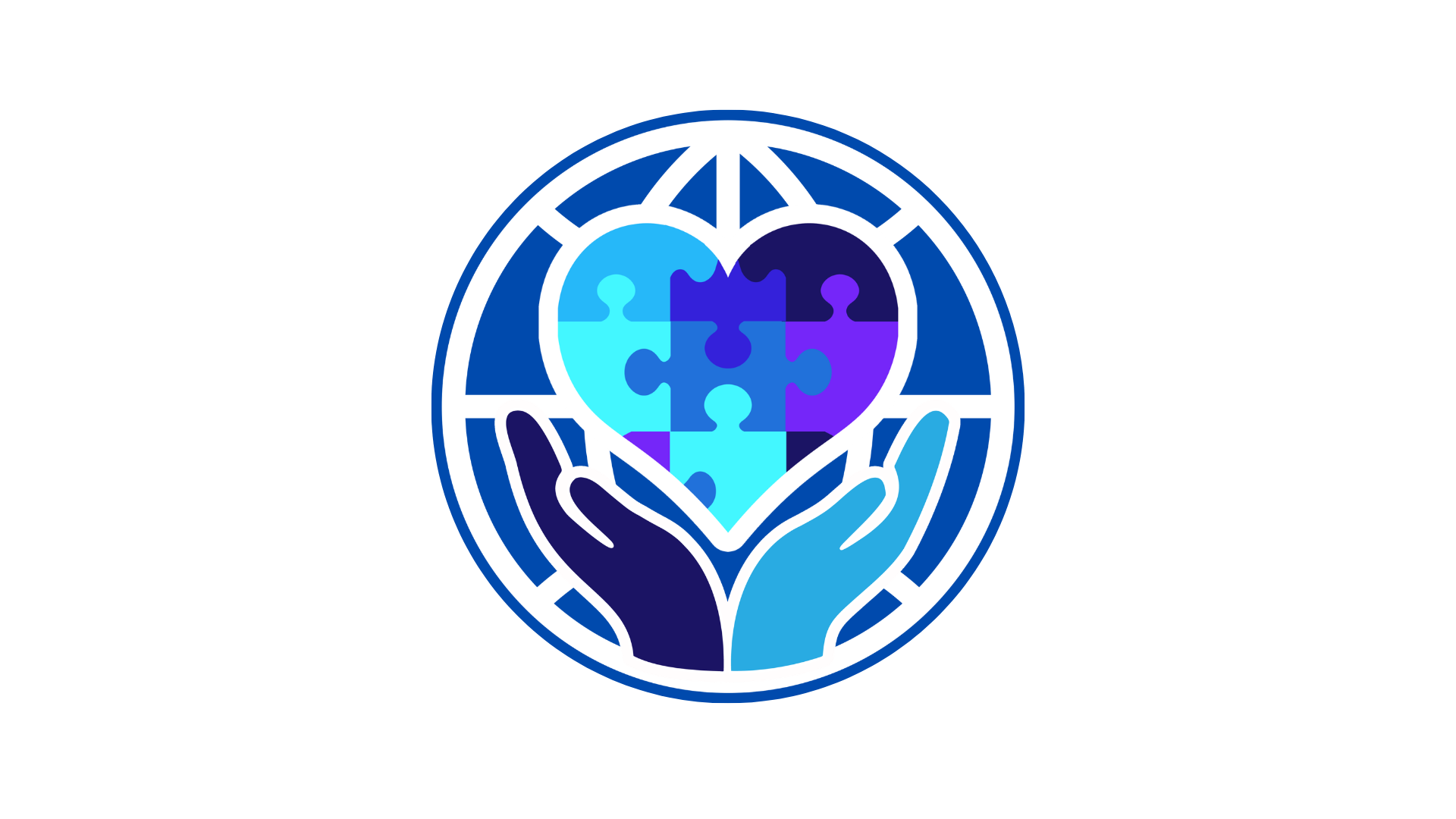

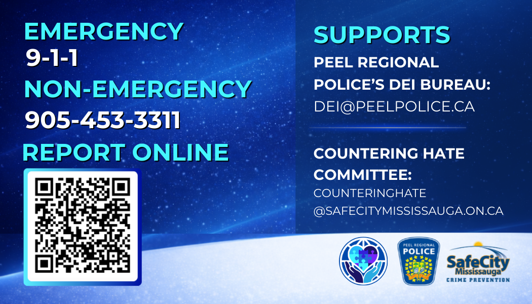
The committee unanimously chose these final logos because they felt they captured the purpose of the Countering Hate Committee in the clearest and most meaningful way, which, after many opinions and many versions, was a win in itself. The hands and heart gave the design a sense of care, safety, and community support, while the puzzle pieces represented diversity, inclusion, and people coming together. These concepts stood out because they were visually strong, easy to understand, and flexible enough to work across different materials without causing anyone another design crisis. The circular version gave the logo a more official, emblem-style feel, while the horizontal version offered a cleaner look for everyday branding and communications (As seen in the wallet card above).